DETAILS
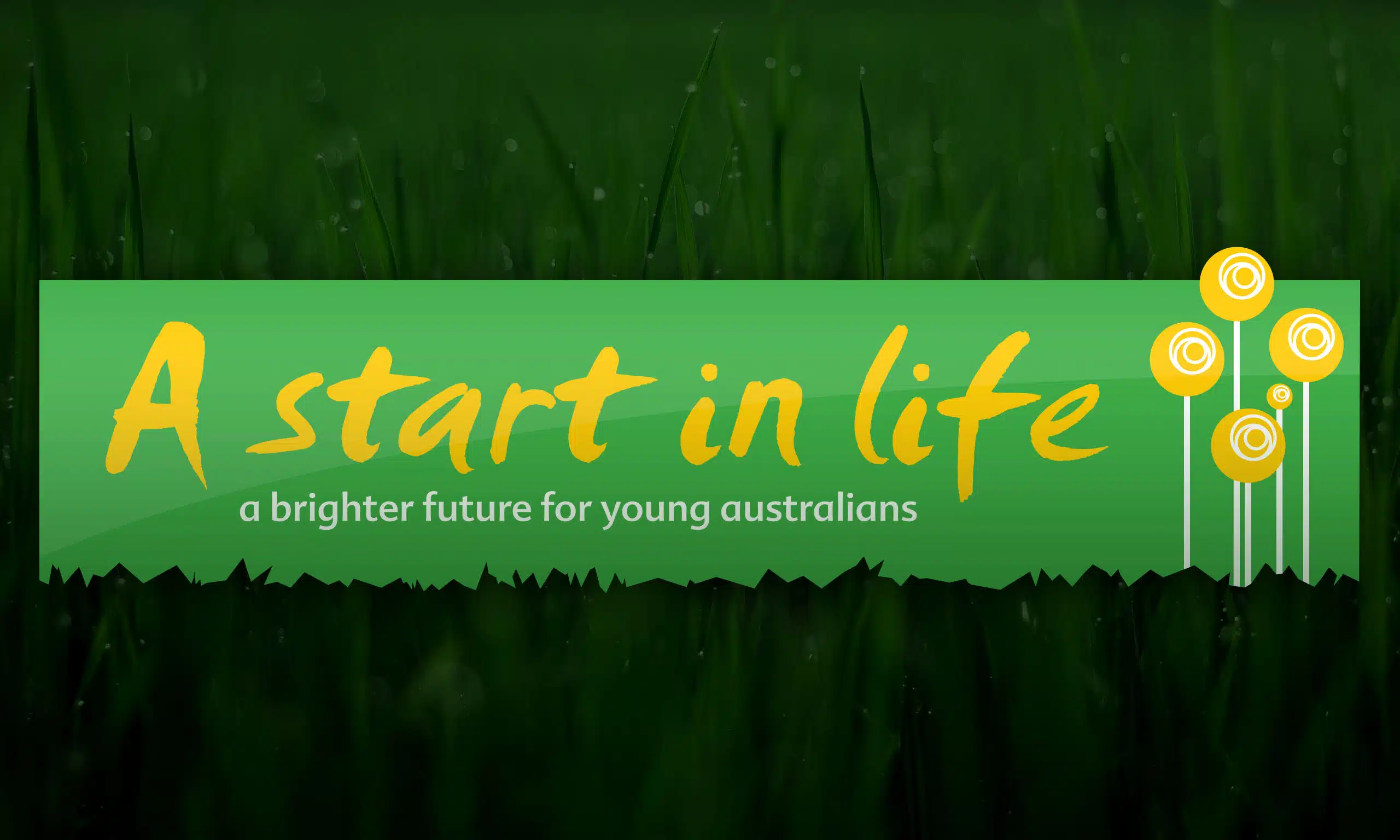
A Start in Life provides assistance to young Australians in necessitous circumstances, helping them overcome barriers and access an education equal to their peers.
APM has been working with A Start in Life for more than twenty years. When they rebranded in 2011, they wanted to move away from their previous, more structured identity. To that end, we introduced a flexible, casual logotype that echoes writing on a blackboard, and brought their mission statement to form a core part of their logo.
The use of green and gold at their request was to reinforce their focus on Australian students and we brought in the element of stylised sunflowers to represent growth and opportunity. The sunflowers are arranged to form the Southern Cross, both as another reference to their Australian focus but additionally to indicate their role as guide that they fulfill for their students.
DELIVERABLES
Stationery // Business cards // Corporate ID Style Guide
Corporate Communications // Digital Signatures


